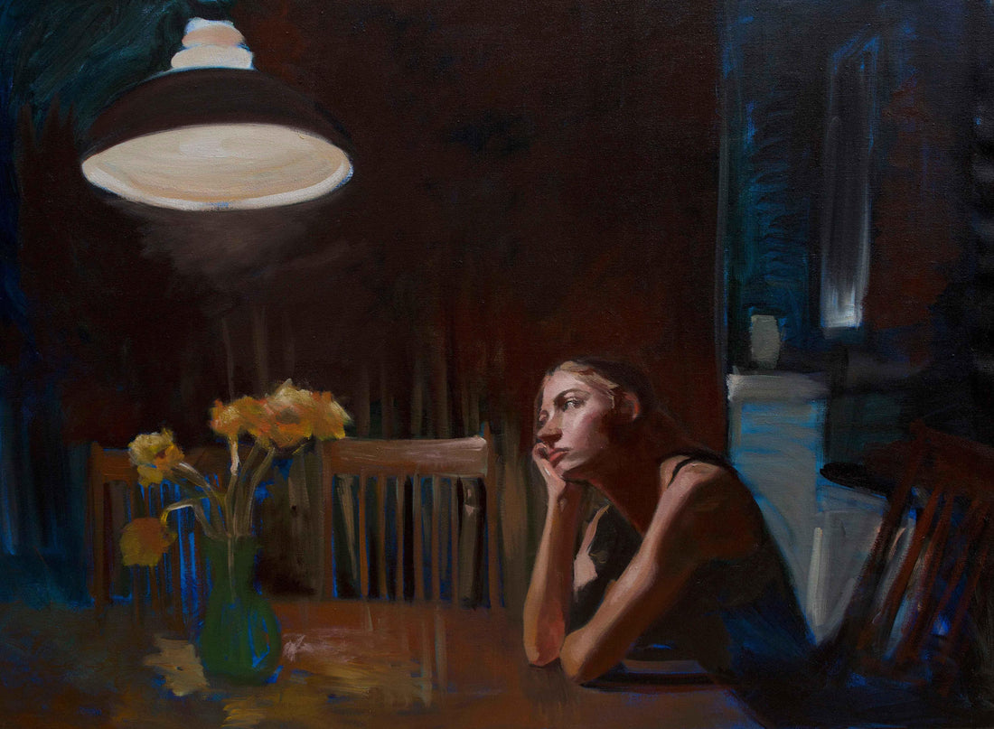
Experimenting with Limitations
Jessica BednarcikI recently came to the conclusion that I was unable to paint a single thing. I was sitting in my studio, surrounded by tubes of bright hues and a blank canvas, wondering where I’d gone wrong. I had this unlimited collection of color; yellows from Hansa to Lemon, reds of Perylene and Pyrrole, just about every superfluous green under the sun, and about three ways to an earthy red-orange (Transp. Red Oxide, Brown Pink, Burnt Sienna itself). I had all the blacks, all the blues, and a variety of white; warm, cool, what have you. With all this color, my canvas remained blank. I was at that point unaware that in my efforts to learn about color and pigment, I’d created a problem: a lack of control.
When you start painting, there are endless possibilities. Size, image, medium, to start. Then comes color. Your first wash, or underpainting, can affect the temperature of the base layer. It can carry the tone of the piece. It seemed like the more additions I made to this unrestrained palette, the more complex painting became.
The more I tried to experiment, the less unity I saw in my pieces. That was, until I experimented with limitations.
In using a limited palette of four colors: an ivory black, a cadmium red, a yellow ochre, and a white, I was finally able to see the finish line. The Zorn Palette, full of cool pinks, shadowy greens, amicable yellows, and the touch of a fiery red, was a far cry from any palette I’d worked from before. But because there was a definite limit to the possibilities of hue in this palette, every color I mixed was somehow related. Transitions from one to another were natural, swift, and harmonious.
The potency and warmth of the Cadmium Red Medium and Yellow Ochre created deep, strong shadows that contrasted beautifully to create warm and cool layers to a tonal black. When mixed with white, the colors became bright pastels that offered a more interesting solution than using pure white. Titanium White and Ivory Black mixed to create a cool tone that became the foil to the palette’s intense warmth. This blue-grey balanced out the heat of the skintones, and was sparingly dotted into the shadow of the eye, the negative space between objects, and into the quiet background of the picture. With my now limited possibilities, I focused on the glow in the reflection of the skin and the loose gesture of shadow. I was able to find my painting through the simplicity of limitation.
Some FAQ:
Why Cadmium Red Medium instead of Light?
Gapka’s cadmium red medium has a cooler undertone than the cad red light. By having this versatile red available in the palette, the range of available hues is expanded. The reds can be warmed with the yellow ochre and can be cooled by ivory black and titanium white.
How can I tone down my colors?
In a palette like this, it’s helpful to create a few pre-mixed colors to help along the way. I began every session by mixing colors I knew I’d need, so a dark red, a dark green, several values of black & white, as well as pure mixtures of white with each color. I mixed these first so there was no chance of them being muddied. Then, to tone down a strong hue, I like to pre-mix black and yellow ochre to create a warm, dark green. When this is quickly added to its complement, red, the saturation of the red is muted and can blend seamlessly into the existing painting.
How does the opacity of the palette affect the outcome?
I’m glad you asked. This palette is unique in that it contains primarily opaque pigments. Usually, oil painting involves working with a varying range of transparencies, which adds another layer to the thought process. If you wish to keep areas thin, you need to take this into account at every stage of the work, avoiding those areas at every step. With all opaque paints, you’re able to focus on color, rather than the transparent effects of the paint. Of course, you can still work with levels of transparency by diluting or using different mediums.
I enjoy this palette with a thicker medium, such as a liquin impasto/thick oil variant, that allows for layering of paint rather than thin application. It better suits the opacity of the paint and the overall look of the painting.
